Urbanity in the 21st century
Rarely is there an opportunity to develop a new, independent district in the centre of a city and thus to reflect on its urban and sociological character.
How do you develop and set framework conditions so that this lively mix of living and working is achieved in houses, on public streets and squares as well as green spaces?
With the association of metropolis, living situations are emerging in our minds in which the boundaries between living, working and leisure are becoming increasingly blurred, as in the near future these will no longer be separated from each other in terms of time and space, but will be deliberately interwoven.
Our idea of a modern city open to the future begins in itself in the willingness of people to engage with it.
The big trend to move to the cities is mainly due to the fact that people are looking for proximity to others. In contrast to the virtual digital world of social networks, people in the city seek real participation and the satisfaction of being part of a modern and urban community.
The Master Plan
The intermixing and linking of living, working and leisure is a prerequisite for a lively urban district with a sustainably high quality of stay and life. The urban planning specifications of the master plan offer the necessary prerequisites for this: On the one hand, this is made possible by the specification of the vertical height development as urban densification; on the other hand, the continuous base provides the necessary connection to form a common ensemble from the individual solitaires. This base acts as a frame that circumscribes the space in between as an urban and lively square. Accessed by staircases and ramps, the layering vertically expands and stages the experience space of the residents and passers-by.
Design concept of the high-rise ensemble
We take up the formation of the plinth and continue it as the idea of horizontal layering. Our design approach is therefore based on three levels of action:
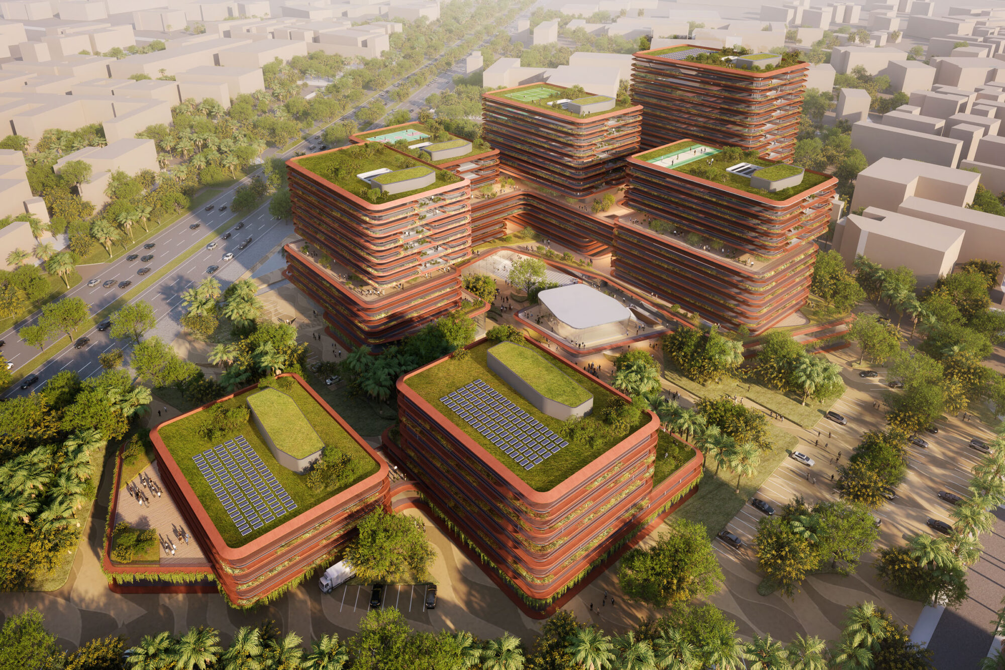
- Continuation of the layering for the plastic interlocking of the base with the rising building ensemble
- Twisting of the two structures in relation to each other to increase their physicality
- Bending of the building façades on their long side to increase visual plasticity
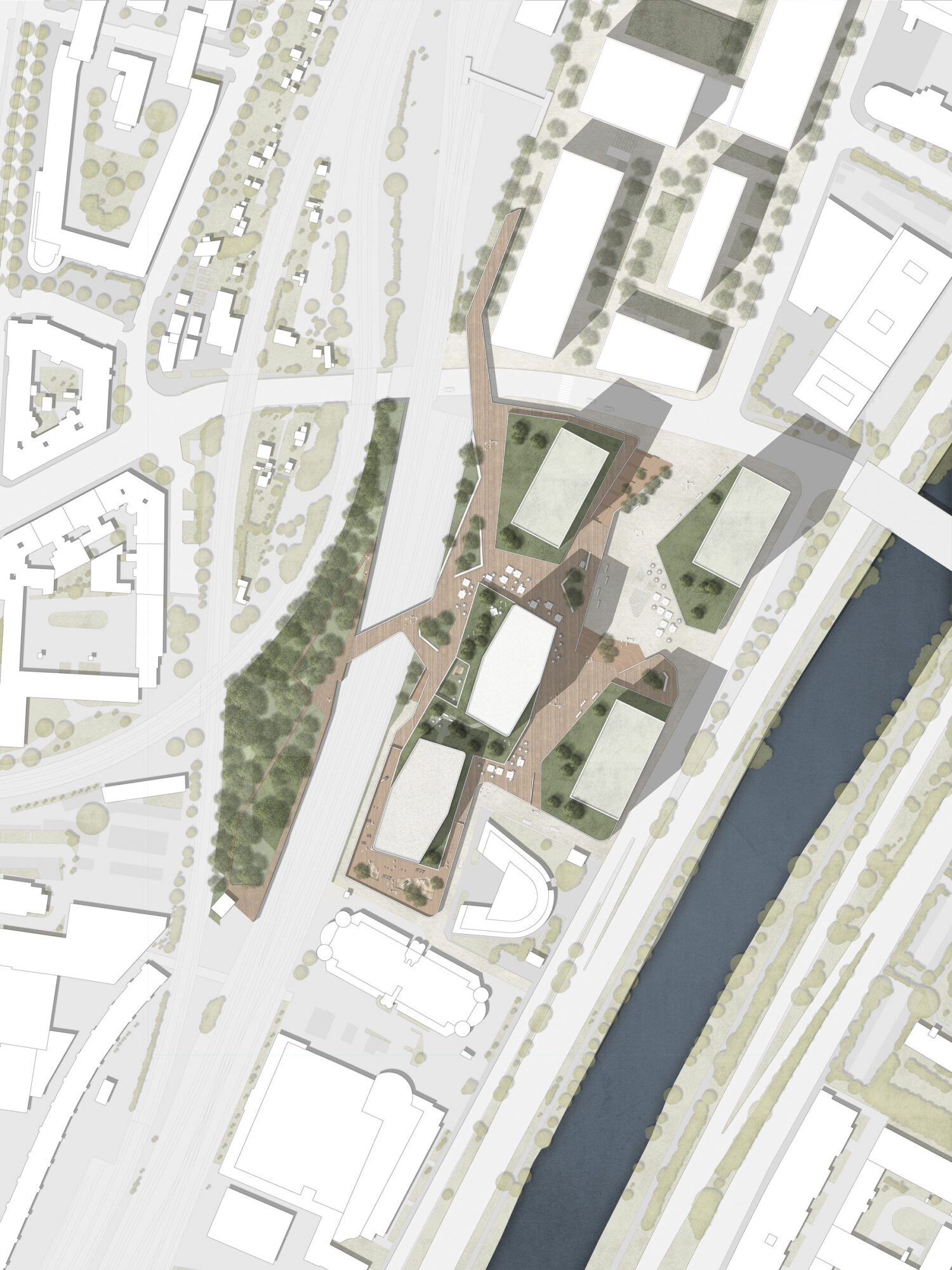
Our approach is shaped by the fact that the building ensemble should always be recognisable in its perception as part of the new quarter. The ensemble is not intended to be additive, grafted onto the plinth, but rather to continue to rise conceptually from a stratification from the new central square of the quarter upwards. The two new buildings are treated typologically and visually in the same way, even though they are of different heights. This strengthens the perception of the lower building in particular and also moves it closer to the central square.
On top of the base building we place a connecting body as another base underneath the two new buildings. This springs back from the front edges of the plinth structure and experiences deliberate angular offsets. They have the effect of creating a tension-filled interlocking of the individual storeys. This will also create inviting and varied recreational areas on the roofs, which will also provide access to the two new buildings. This creates varying spatial situations along the path for residents and passers-by.
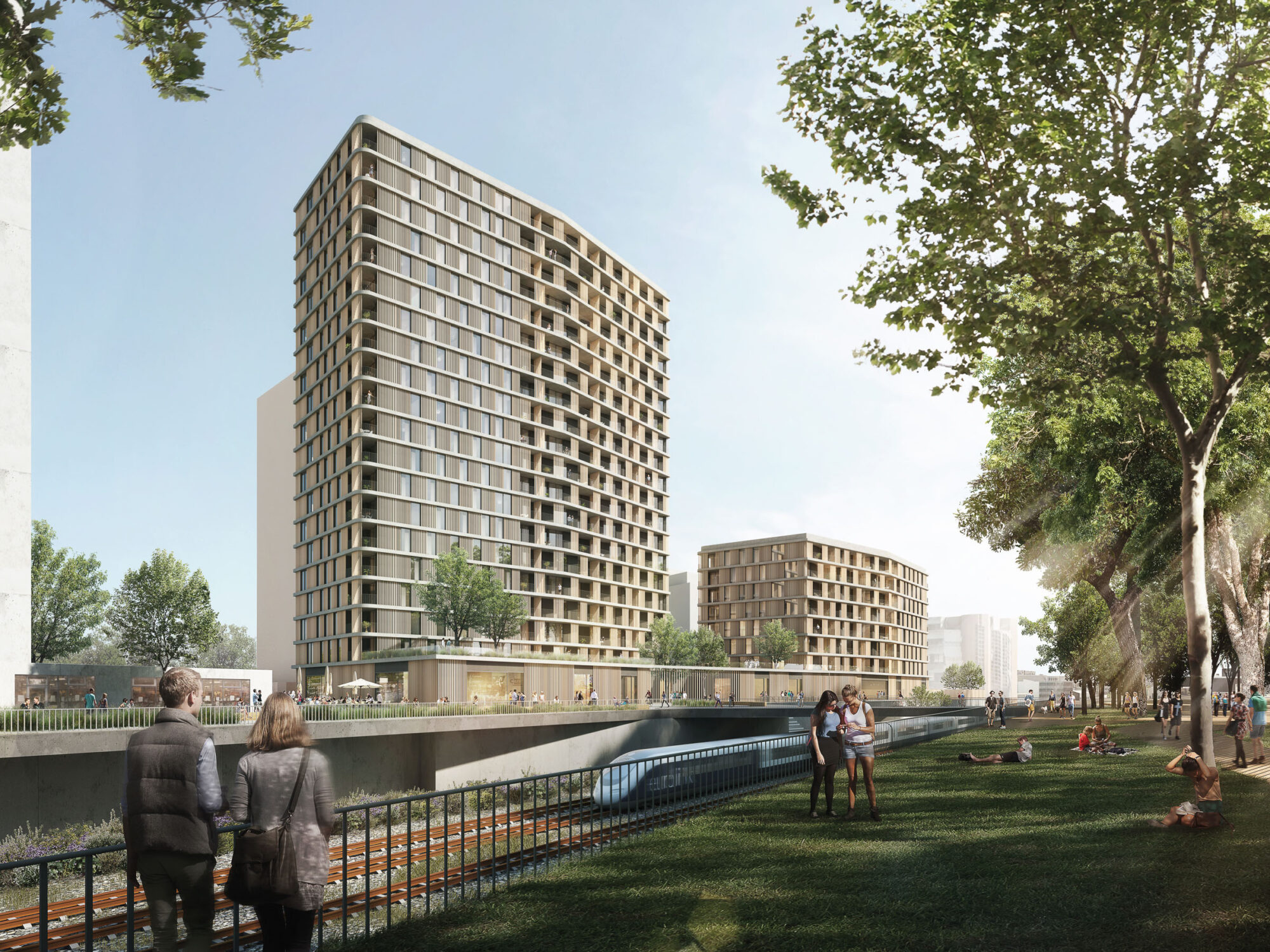
The roofscape above the 2nd floor continues this impression and is thus perceived as a fifth façade. These three interventions lead to a strong increase in the perceptible plasticity. The variance creates original set pieces that characterise the respective place and are also perceived physically from the central square or from the track park opposite. The buildings are now perceived as being located in their surroundings.
The two new buildings above are not designed as rectangular volumes, but are angled on the long sides in order to break up the length of the structures in a multi-faceted way. In their position, the two buildings are offset from each other along the longitudinal axis. This not only creates a noticeable visual moment of force between them, but also gives the two end faces facing each other more social distance.
Façade concept
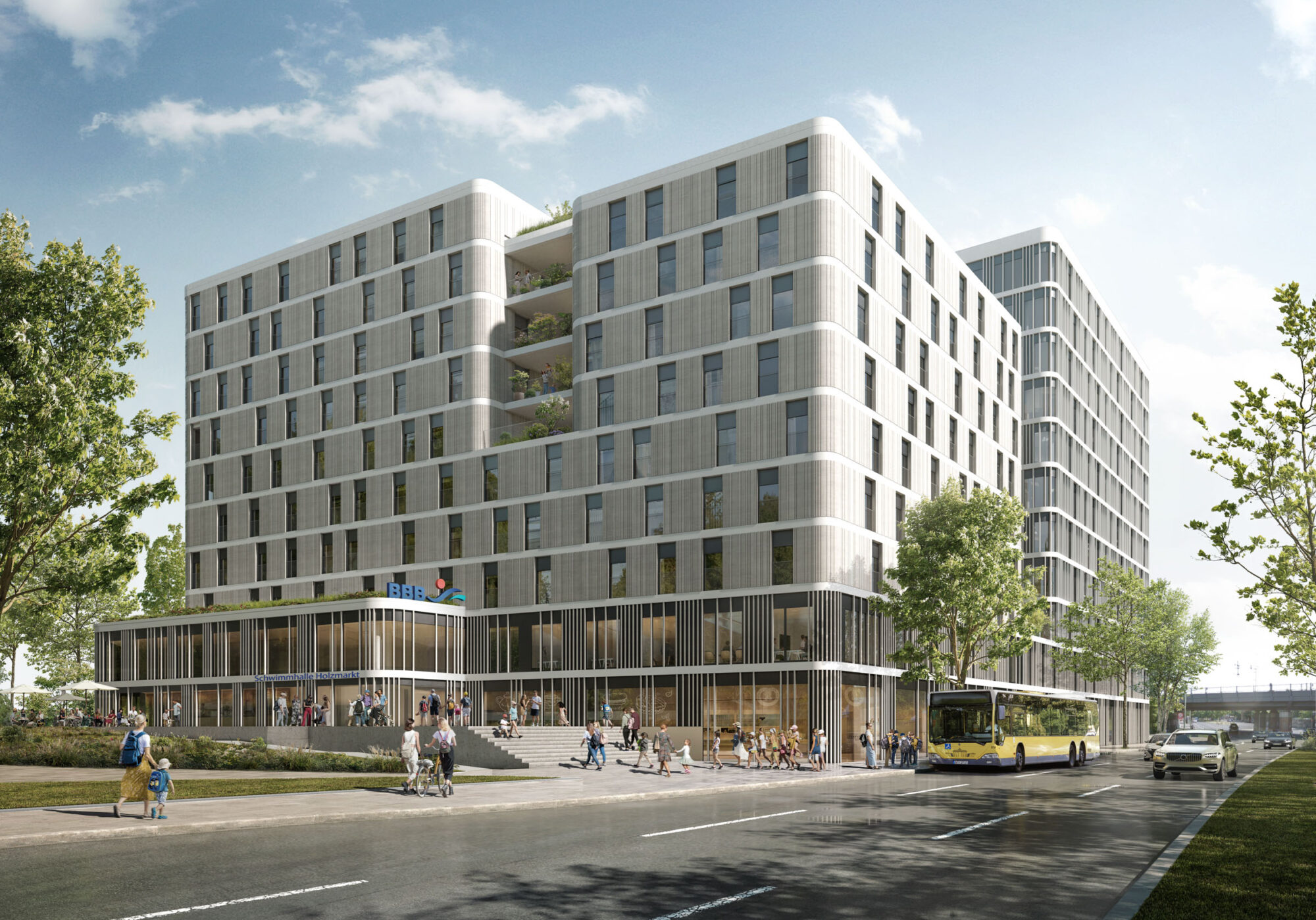
With a height of 72 and 34 metres, the two residential towers clearly mark the north-western corner of the new area. In their architectural appearance, they are primarily characterised by the lightness of the layering of storey slabs. The facetted buckling of the façades leads to an increase in plasticity and leads to ever different perceptions over the course of the day and the sun
The clearly structured façade with its deliberately restrained and at the same time physical appearance is the striking calling card of the residential towers. The loggias created by the recessed façade in some areas, which are further extended by recessed areas, grant the flats a high degree of privacy.
Floor plan, typology
Our idea of modern living is characterised by a layered arrangement from the outside to the inside; the optimal orientation of the flats attest to the quality of the living value of the flats. The windows are floor-to-ceiling and provide an unobstructed view of the city or the adjacent track park to the north. It creates a wonderful feeling of expansiveness on the outside and spatial generosity and openness on the inside. The living rooms are embedded in the centre of the floor plan and have corner glazing, which results in each flat having a spatial experience like a corner flat.The flats are accessed via two access corridors that develop from the lift core in both directions. These are offset from each other to visually break up the length.
The kindergarten is located on the first floor in the base building, which is accessed via the lobby on the ground floor. The orientation of the respective group rooms is both to the Danube Canal side and to the Gleispark side. To the west, a large and demarcated outdoor area is provided for the children to play. In addition, a screened-off patio area has been added to the track park.
Next to the kindergarten, areas for gastronomy are planned on the east side, which have outdoor areas and thus also ensure a high quality of stay.
Each building has a clearly recognisable lobby on the 1st floor, through which residents and guests reach the access cores. In addition, the lift cores will be extended to the ground floor, where further street-side access is possible for deliveries and guests.
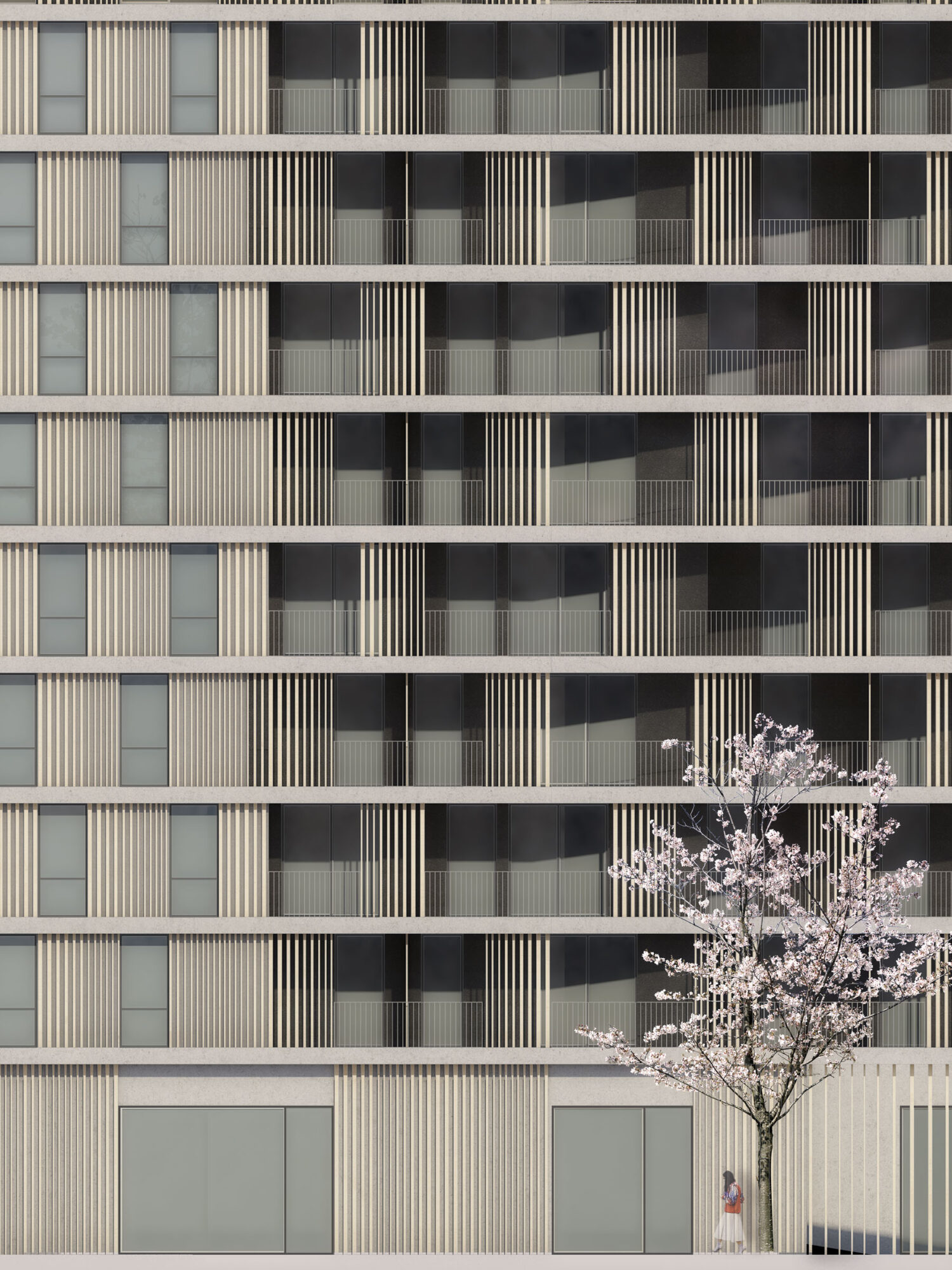
2nd prize competition building site 3,
Service phases 1 to 2, 2017
GFA 34,000 m2
Client: Liegenschaften-Eigentümergemeinschaft Wien Heiligenstadt
